I know this one’s been a long time coming, but I promise it’s worth it. I started working with this family several months ago to give them a family room that was more grown up. A space that felt finished. Don’t we all feel that way? There always seems to be that space that’s just not quite finished. Let’s start at the beginning, so that you can get a real feel for how far this space has come.
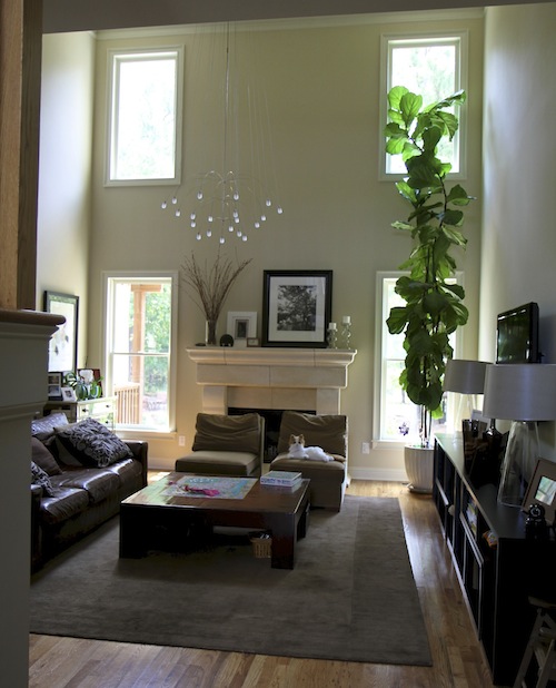
This is the before. It’s a gorgeous home. It was just missing those final touches that would pull it all together.
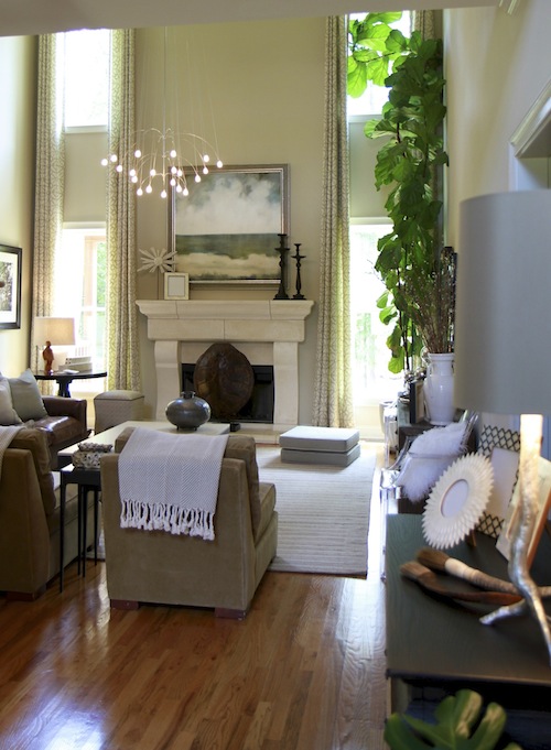
And the after. I love how the space came to life. Moving the chairs from in front of the fireplace opened up the room and made the mantle the focal point instead of the chairs.
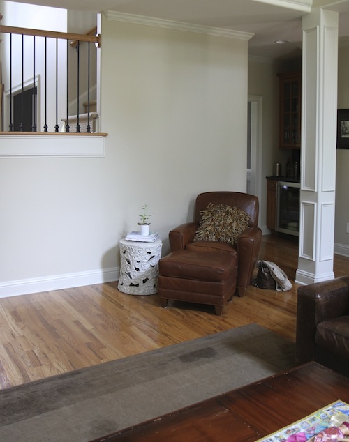
Here’s the other side of the room before.
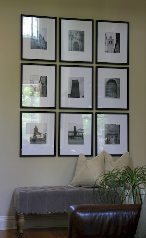
And a closeup of the same wall after. This a great example of how to use favorite photos of places and not just family. These were tiny photos of the small town in Spain where my client’s mother was born. I love how they turned out. This is a great way to fill a large wall. The photos can be of a favorite vacation or from a beautiful calendar that you want to save. The key to this look is the frame. I used a 16 x 20 frame with a large white mat. It makes the images feel more special and important. Hang them close together and the look is one large piece of art.
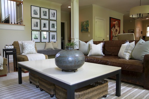
Another shot of the gallery wall.
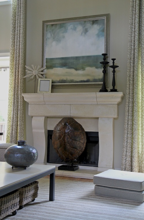
A closeup of the mantle. We chose to place the faux turtle shell here, because my client’s never use their fireplace. The turtle shell was a great way to add texture and also act as a secondary focal point. Remember that a fireplace screen is not always the best solution. You can place a large platter on a stand or even artwork in front of an unused fireplace.
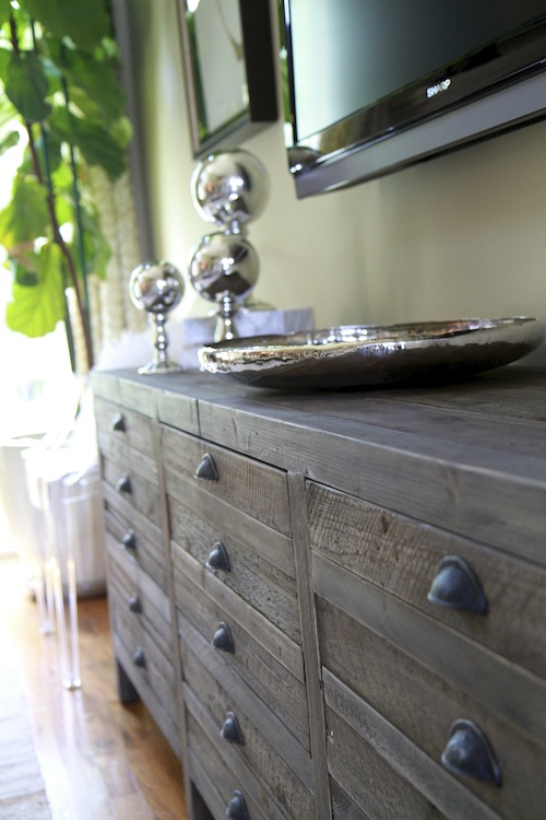
The sparkle of the mercury glass and silver adds another level of texture to some of the more rustic pieces in the room.
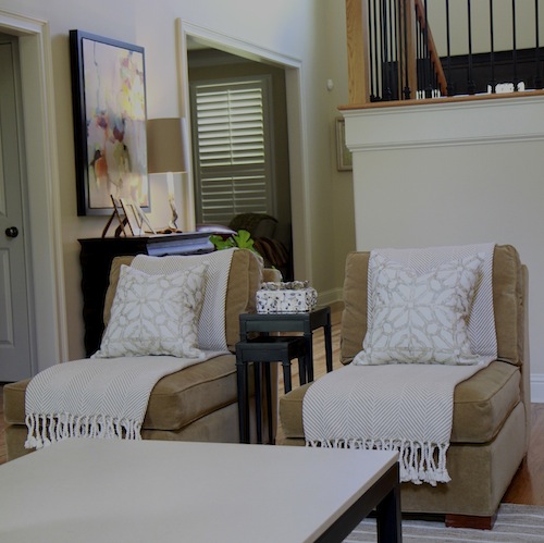
A look at the chairs. These were existing pieces. I added the throws and custom pillows to give them a new look.
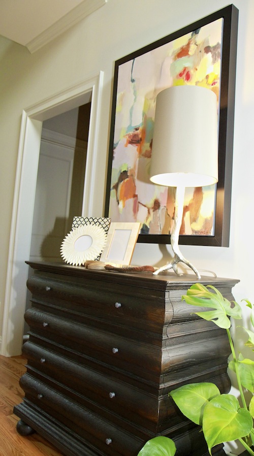
Remember to add some black to your spaces. If we had not added it in this space, it would have felt less grounded. It makes the light colors in the room stand out even more.
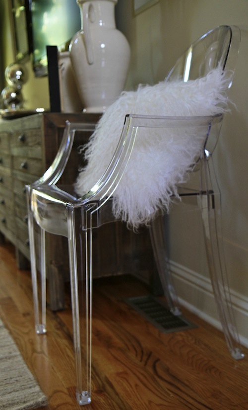
I’m a huge fan of adding a modern touch to all of the spaces that I design. My client had one ghost chair, so we added another to create symmetry on either side of the media cabinet.
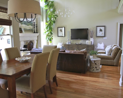
A look into the family room from the kitchen.
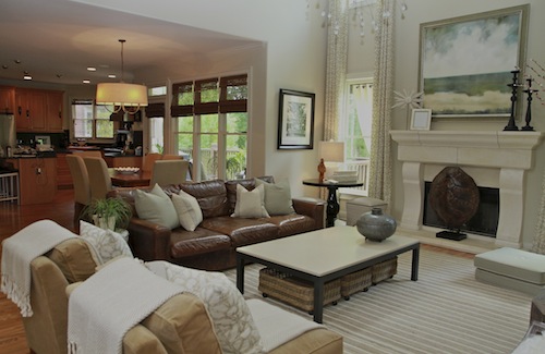
One final look at the finished space.
If you would like my help creating a home you love, please contact me at lori@lorimayinteriors.com.



Lori, it is beautiful! Holy cow at those long panels! Perfect! Moving the chairs was the right thing to do – the mantle is too pretty to hide. Love the art wall and the modern elements too!
Wow, Lori!! This is one of those rooms I could analyze forever, the composition and every element is absolutely perfect! I predict a magazine feature in your future!
Lori,
You are so very good at what you do! What a dramatic change. Love, love, love that turtle shell in front of the fireplace. Those long panels add drama and softness at the same time. This room is magazine worthy now!
As I told you earlier- this room is just gorgeous!!! The art, the ghost chairs, the drapes, the colors—- perfection.
It’s beautiful Lori! The windows, the artwork, how you rearranged the layout – so well done and so much more open now. I really love the artwork – is that from your friends at DK Gallery? It’s so pretty.
Lori you had such a clear vision for this room from the beginning. It’s amazing how, as the homeowner, you look past so many things as you go about your day to day life. Lori, you were able to stay on course as we changed our minds on just about everything. Thank you for bringing in so many textures and patterns that we would have never done on our own. I love how you dressed up the room but still kept it casual and practical with baskets (on wheels, no less) floor pillows, a game table and so much more. I can finally stop thinking about what’s left to do in the room..it’s done and I love it! Thank you!
What a beautiful room! I love the artwork over the fireplace…and really love those ghost chairs. I like the eclectic mix of modern and rustic you created in this space! Thanks for sharing!!
Well done Lori! This is such a great space and you really let it shine. I love the mix, soothing pallet, and special touches. And the new layout just transformed the whole feel of the space! Thanks for posting and can’t wait to see what’s up your sleeve next 🙂
I absolutely love what you did! Simple changes, but what a difference they made. The gallery wall is awesome and I love the modern touch of the ghost chairs.
Girl blow it up! This is fabulous!! I’m gaga over the window treatments and that pattern. How many times do we come across that two story double window scene that can sometimes look dated? You turned it into an asset and made it look so NOW. I can only imagine how happy your clients must be. Keep painting the world pretty!
xx
Jen
This is absolutely gorgeous Lori! Great way to tackle a two story space. Adding this one to my pinterest board!
Thank you! I really loved this project.
Beautiful work!! I would love to know where you found that drum shade chandelier in the kitchen. I’ve been looking for one exactly like that for my dining room forever!!