Today, we’re talking accessories. I think this is where many of my clients have the most trouble. They either have no accessories or more often, they have covered every open space with every chotski and picture frame known to man.
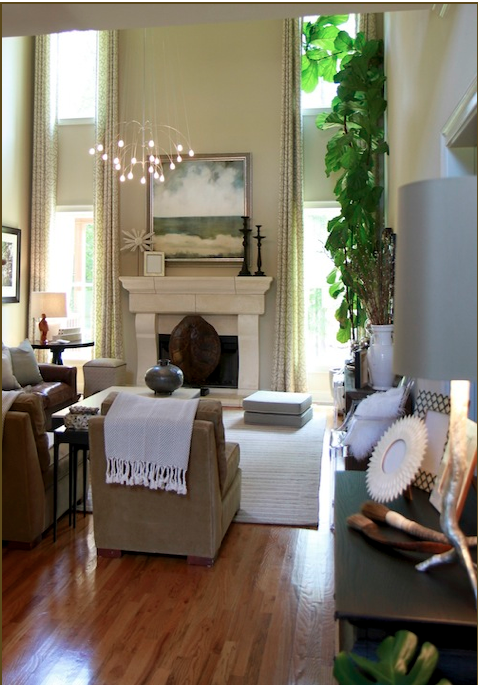
Let me tell you a designer secret. Knowing what to remove is just as important as knowing what to add. In this project, I brought many more accessories than I actually used. When I arrived for this install, I removed every accessory from the space. I staged them all together, positioned the furniture and then started adding the accessories. This is not a quick process. There’s a lot of placing and removing until it looks and feels right. Right, can mean lots of things.
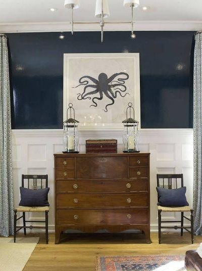
Here’s a great example of perfectly symmetrical accessories. I love this look. (Those lacquered walls don’t hurt either.) Symmetry just feels right to me. But, it’s not the only way.
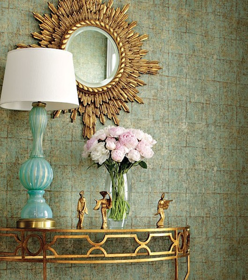
This gorgeous vignette is from Tobi Fairley. It’s not symmetrical, but it works. It feels balanced.
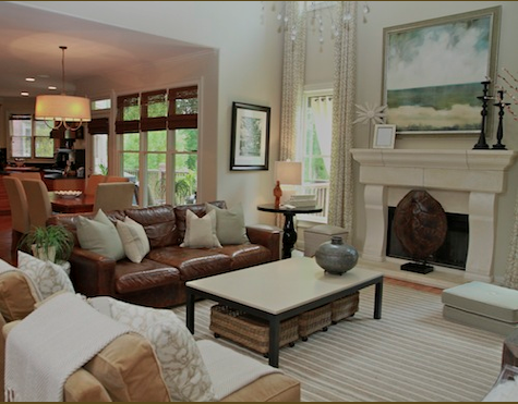
In my latest install, I only placed one item on the oversized coffee table. Remember how you live. My client has two young kids and this is where they play. Most of the time the coffee table is covered in legos and polly pockets. It was important for me to take this into consideration when accessorizing the coffee table.
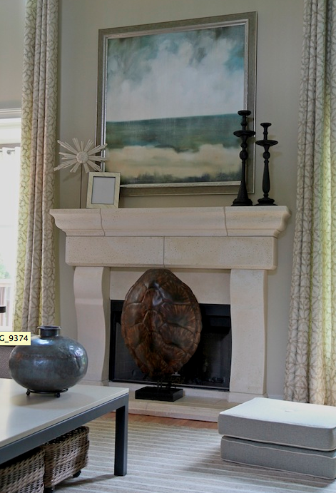
Remember the focal point. In this vignette, there are several things that could be the focal point. I wanted the beautiful original artwork to stand out. If I had covered the mantle with frames, candleholders and objects, nothing would have felt special. Instead, I chose 4 pieces that would complement and draw attention to the art. The accessories almost “frame” the artwork.
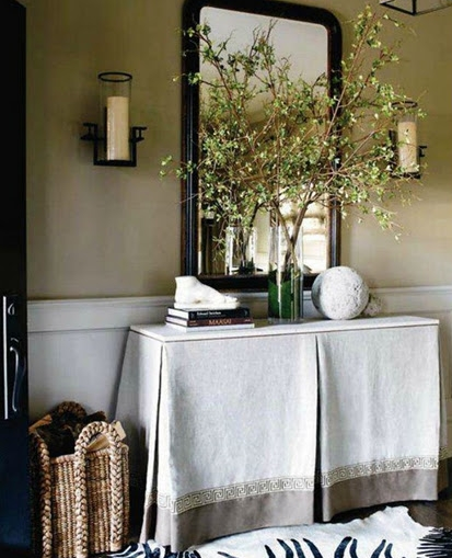
This last example shows both symmetry and restraint. The sconces and the vase create the symmetry, while the other objects could look cluttered, but you can see that there are very few items on the table. These items now feel important, not cluttered.
My tip for your home would be to take one space at a time and remove all of the accessories. Then, add back only the things that you love. I really mean it. I know that you’ve been given some beautiful things, you’ve found some great deals at HomeGoods, but do you love them? If you don’t, please get rid of them. I promise you’ll thank me later. In order to have a home that you love, you must be surrounded by things that you love, not things you like. Life is too short to be surround by likes. I want you to be surrounded by loves.
If you’d like help creating a home you love, please contact me at lori@lorimayinteriors.com. If you’d like to see more of my day to day tips and finds, follow me on Facebook, twitter or @Lmayinteriors on instagram.



Thanks for all the tips!
You’re very welcome, Jamie. Have a great week!
Wonderful, great advice!
Looking forward to meeting you tomorrow.
Thanks Patty! Can’t wait to meet you!
Lori, I use to tell my clients Less is more, big is better!! I used that as my mantra for years. I agree with your techniques and advice completely,
Kathysue
Thanks Kathysue! I love your mantra! I may have to adopt that one myself!
Hope you’re well,
Lori
When I site a garden from my own design I constantly have to walk out of the space and look.
Doesn’t matter the size of a landscape, 2 inches with an urn placement will make or break the space.
With guys & big equipment waiting to plant, it’s frustrating. They don’t ‘get’ the importance of an inch. Especially if there is a huge stone exactly where I want the urn to go !
Enjoyed your lecture today.
Garden & Be Well, XO Tara
Thank you for coming today, Tara. I enjoyed meeting you and look forward to reading your blog and seeing more of your work!
What is the fabric you used for the window treatments on either side of the fireplace? I lvoe it!
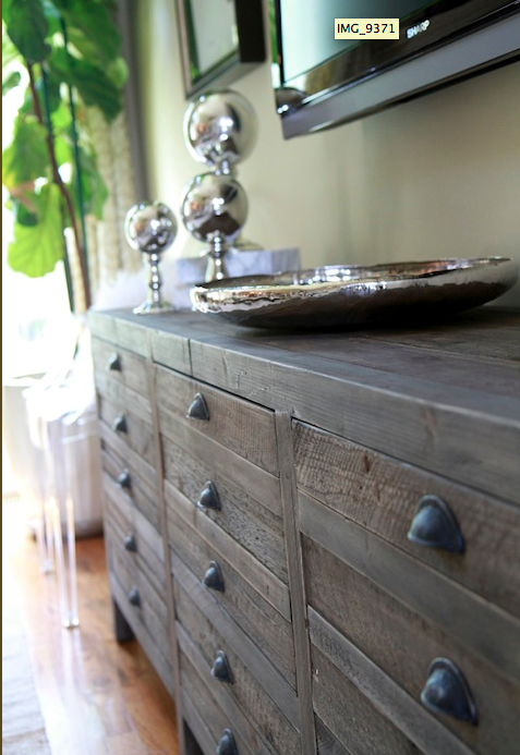
Well said my dear! You did a fabulous job as always. There are so many favorites in this room, the art, drapery, TV console. Awesome!