If you’ve ever designed a space before, whether in your own home or for someone else, you know that you make a plan and it all goes smoothly, right? Huh? Of course it doesn’t. It never does. Some go more smoothly than others, but it never goes “as planned”. So, today I thought I’d share a few tips from the project I posted about on Monday. I hope these tips will help you as you plan your next project.
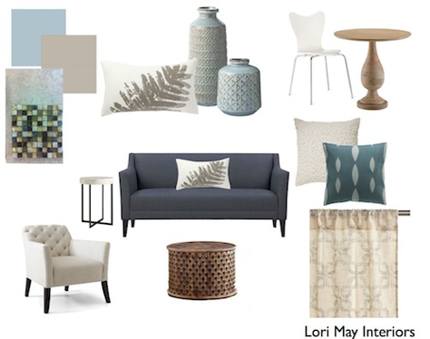
Okay, here’s where I started. The first thing I chose when creating this plan was the paint color. That’s not always how I do it, but this time it was. Sometimes, there’s a piece of artwork, a rug or some other accessory that will be my inspiration and then I’ll choose a paint color that coordinates with that item.
1) How to choose a paint color. This really has a lot to do with your space and how you want it to feel. In this space, my client wanted a calm serene feeling, so that she could feel relaxed after a long day at work. Also, her favorite color is blue. When choosing a paint color for your space, find photos or favorite pieces that you love. Don’t worry about why you love them just choose. Then, look at the colors. Are they dark, light, neutral? Start there. Find a color that makes you feel the way you want to feel in your space.
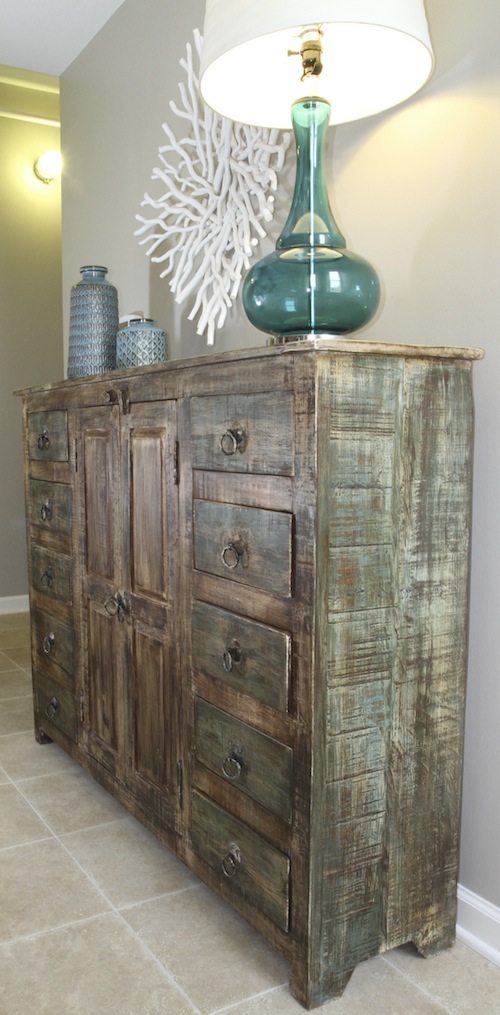
2) Tile floors vs. wood Why did I choose tile for this project? The loft is an open floor plan of 6oo square feet. The key here is that it’s an open floor plan. That means that the kitchen is open to the living area. This is a second home for my client, so there may be long periods of time when she’s not there. If there happens to be some sort of leak in the kitchen, wood floors could be ruined. Tile, however, is just about indestructible. Using one floor surface throughout the space also makes it feel larger. Bottom line, consider how your space will be used before you choose your materials.
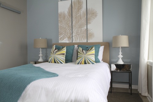
3) Accent walls-This bedroom is pretty small, so I decided to add an accent wall to create more interest in the space. The blue color frames the bed and the panels above create a graphic focal point. The space is open to the living area, so to paint the entire space blue would have felt choppy. One wall adds interest without disrupting the flow of the open space.
4) Mixing whites-Remember that all of the whites in one space do not have to match perfectly. It actually gives more depth to the space when they don’t match. Coordinating is much more effective and can add texture. In the photo above, the bed is actually a pure white and the curtains, panels and lamps are very creamy. Even though they are all slightly different, they work.
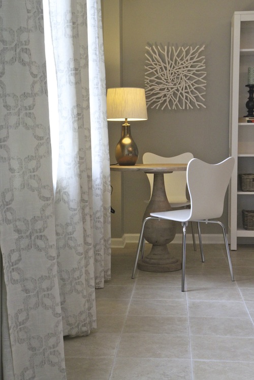
5) Use both modern and rustic in the same space-I love a collected look in my spaces. One of my favorite ways of doing this is by mixing rustic and modern furniture and accessories. This is one of my favorite spaces in the loft. The white lacquered chairs, turned pedestal table and metallic lamp feel collected, not matched. Another bonus is that these pieces add texture to the space.
6) Mix shiny and matte finishes-The photo above also shows how you can mix both shiny and matte finishes. The lacquered chairs, the metallic lamp and the rustic turned pedestal table are all different finishes, but they work together. The lamp is a metallic bronze and the legs of the chairs are chrome, but it works.
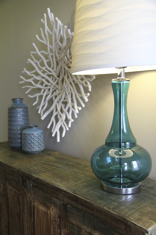
7) Think outside the box when it comes to accessories. In this space, I found these white twig bowls that I used as wall decor. Many times it also is a more inexpensive option as well.
I hope these tips will help you with your next project. There are many others and I’d love to hear yours. Share them in the comments!



Great advice Lori – thank you! It is nice to hear your thoughts behind the design plan. The space really is beautiful!
You are so great with texture, Lori. I love that one shot that is your favorite as well as it’s such a nice combination of shiny, smooth, and rough. The table mixed with the chairs and the twigs is the background is so nice. I also really love the tip about the tile vs wood flooring. What is the main paint color throughout the loft? I think you’ve accomplished your client’s goal of calm and serene and bringing in the blue. It’s beautiful. And I think you’re right, it all looks collected.
Thanks so much Holly! The paint color is Anew Gray from Sherwin Williams.
Take care!
Great tips Lori! and sooo love this project.
What a beautiful space! Fun to hear your thinking on it all and how it came together. Also great to see a space started from the point of a paint color, often designers get called in at that point in the process and this shows that all can go well from there!
Cathy
I am in LOVE with the finish on that cabinet. Did you do it yourself or did it come that way? I’m curious on how I can do that to an old console table I have.
These are wonderful tips and such a lovely space! Very nice work. Love the suggestion of matte with glossy, often overlooked. So glad I found your blog.
Thanks Lauren! Glad you’re here!
Thanks for the great tips. I am completely smitten with the white twig bowls used for artwork…fabulous idea!!
I know, I love those bowls as well! I wish I had gotten one for myself!
Thanks for putting your tips together for us, Lori and taking us through your thought process! Another, wonderful design job!
Great tips Lori! I love the cabinet and finish ….that light isn’t bad either! ha 🙂 I’ve been seing those fun colored glass lights everywhere. Might have to get one 🙂