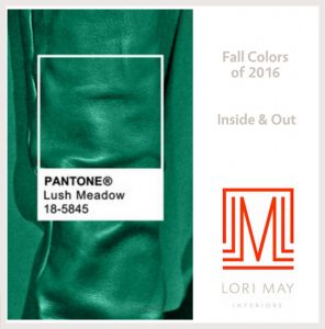
September holds a special day, the first day of Fall. We love the change of the weather and especially the colors! Pantone has released their beautiful collection of Fall Colors for 2016. The deep gem tones are simply stunning.
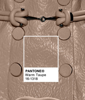
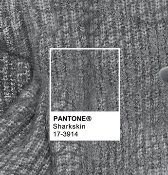
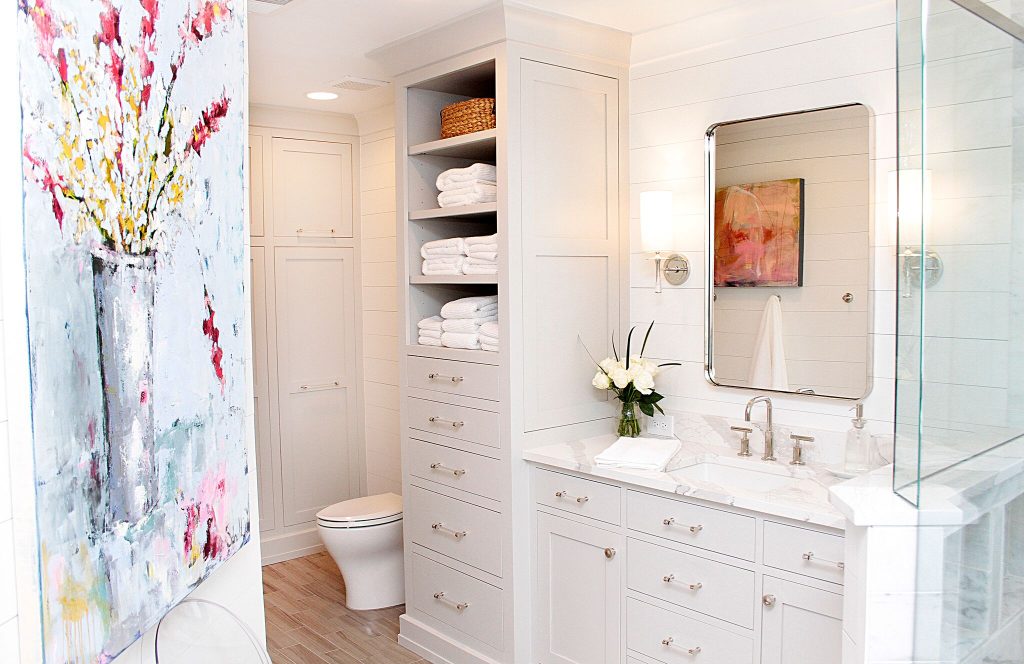
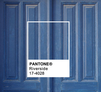
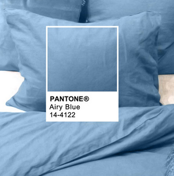
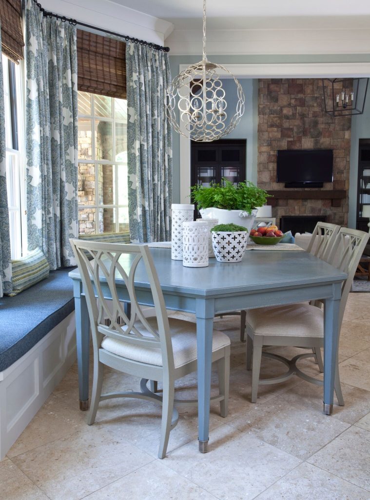
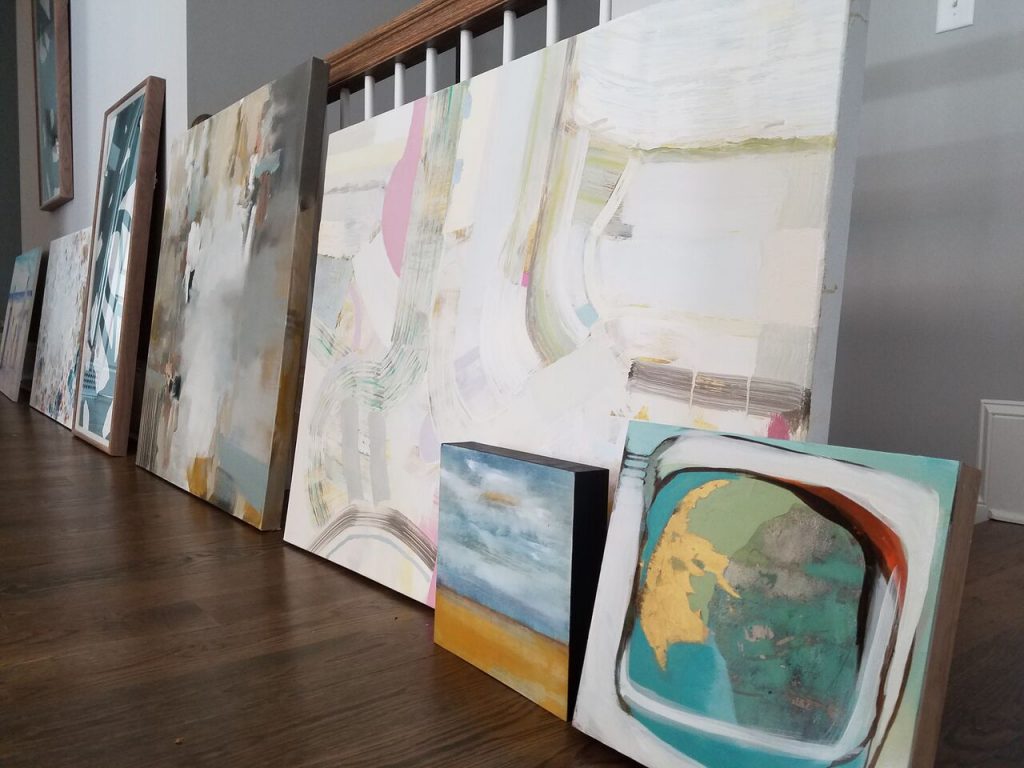
From blue hues to muted neutrals and bold gem tones, this Fall palette is full of gorgeous color. Warm Taupe, Riverside Blue, Airy Blue, and Sharkskin are beautiful together and they can also stand on their own. Here are some of our past projects using these pretty tones:


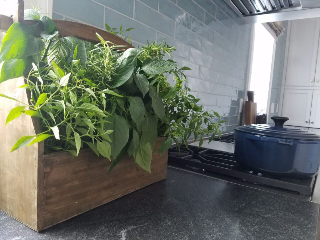
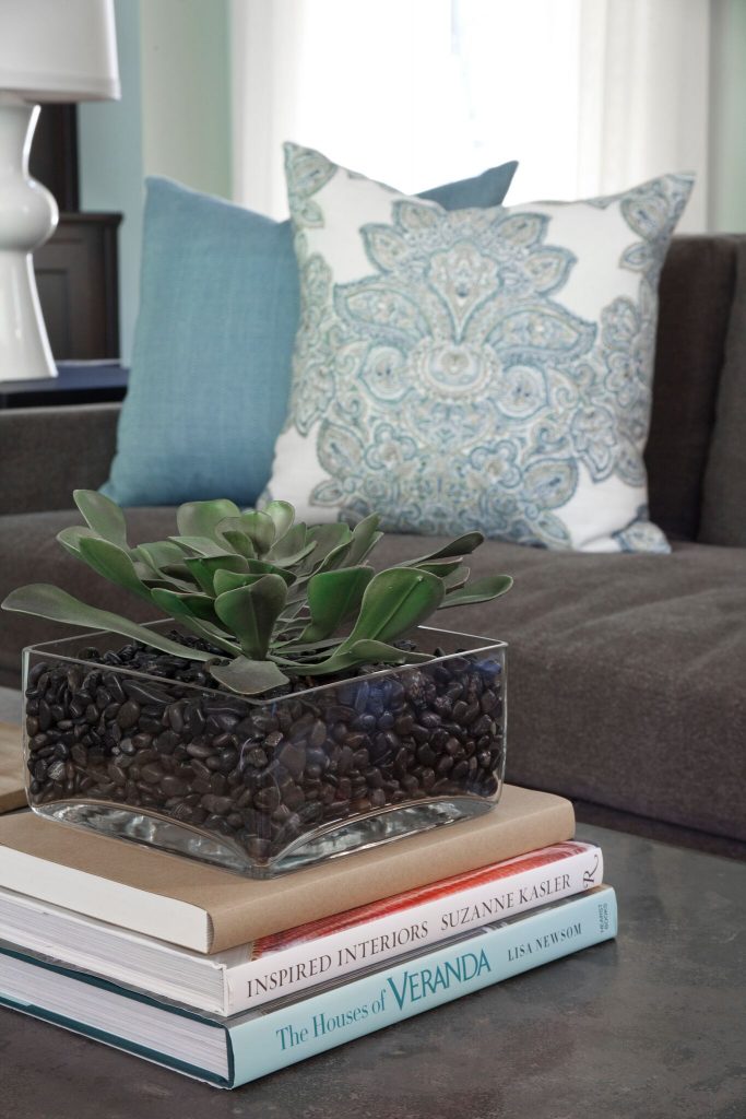
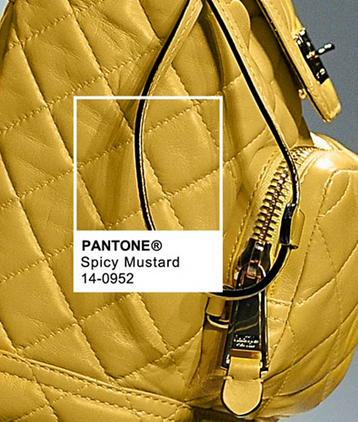
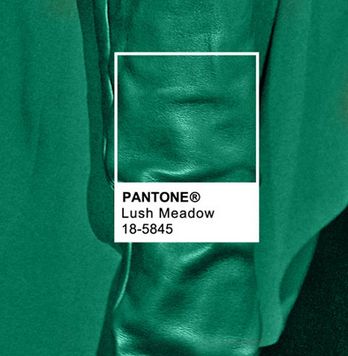
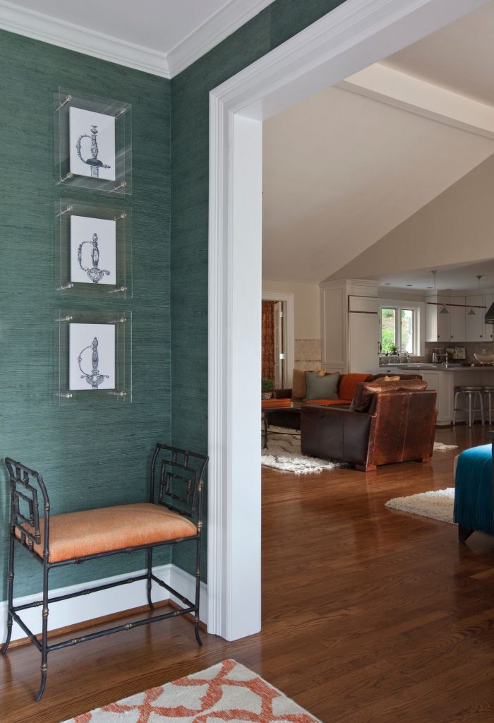
The gem collection features Spicy Mustard and Lush Meadow. We love these two colors together. They are the quintessential colors of Fall foliage, which is just too pretty to keep outside. Bring in the colors of the season – which are beautiful year-round, with an accent wall, accessories, and original art. Bold colors can sometimes be hard to commit to. Accessories, art, and pillows are wonderful solutions for bringing in color.

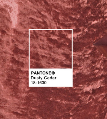
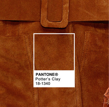
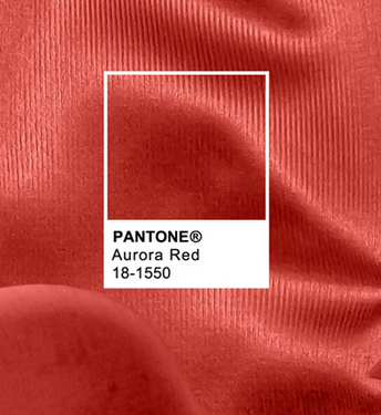
Three variations of red are the reds of the season. First is Dusty Cedar, then Potters Clay and Aurora Red. Each evoke a different mood and richness. Together, they remind me of the varying shades of a rust colored leaf or flower petals. These tones mirror the color of Fall.
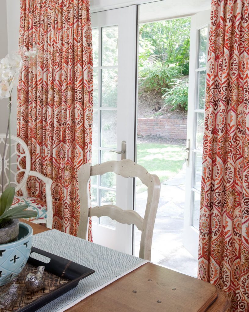
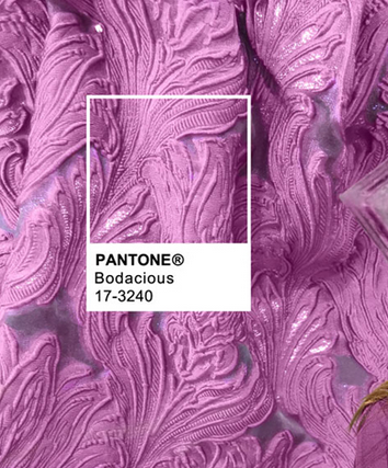
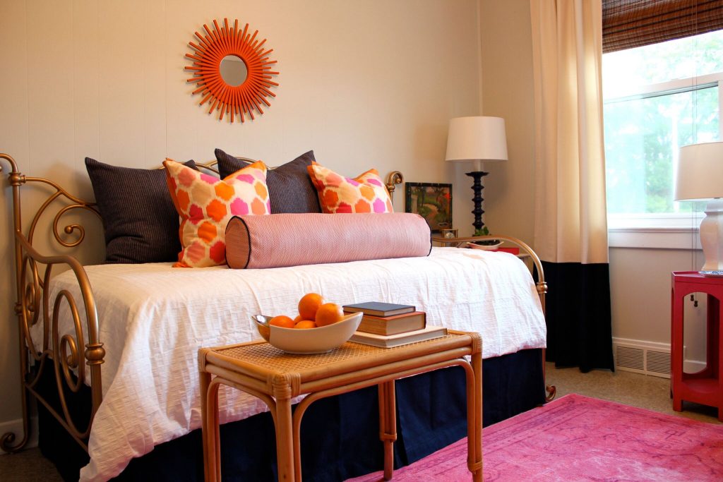
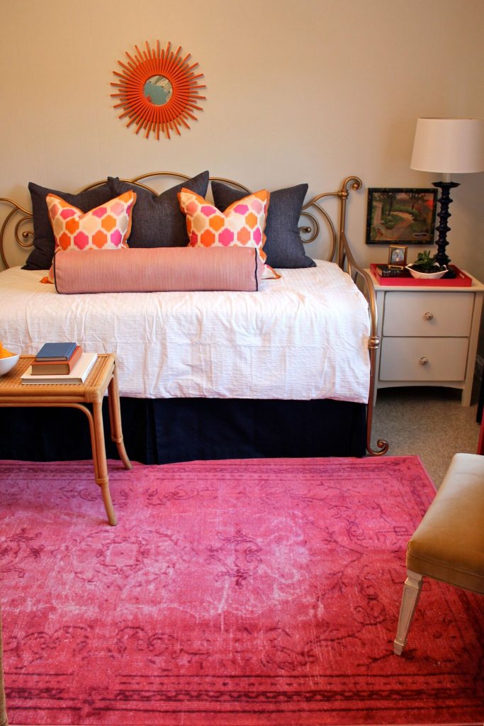
The last color is perfectly named “Bodacious.” It can be powerful when paired with Spicy Mustard, or muted when placed alongside Warm Taupe or Sharkskin Gray. Below is a collection of when we used this color, and how pairing this Bodacious Pink with different colors makes for completely different looks. We love it!
