Your personality shines through in the way your home is designed. Elegant, Welcoming, Casual, Fun, Eclectic…all descriptions of who someone is and how their design style can reflect who they are. Just as anyone gets a makeover, a new haircut, or a new wardrobe, our homes get makeovers too. This time I decided it was time for a branding makeover; new logo, new website, and new freshness to the way our design firm’s brand feels.
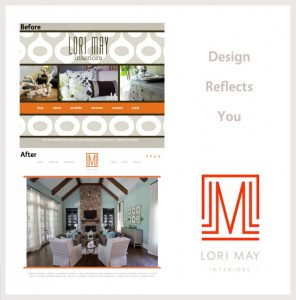
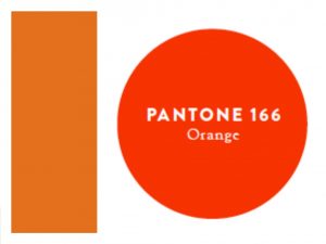
First we decided on our color palette and we grew the other elements from there, just as we do when we begin a design plan for our clients. We loved the original tones we’ve had for a few years, but we wanted to deepen the orange tones to be more neutral in color. In a sense, we basically changed out the brighter throw pillows for a darker shade of the same color. Little changes can make a big impact.
Once our color palette was selected we went into the design and the feel we wanted our new logo to have. Being inspired by modern living, classic elements, elegance and chic style we wanted something bold and distinctively “us.”
Take a look at the Before & After of our past and now new logo. We love it!
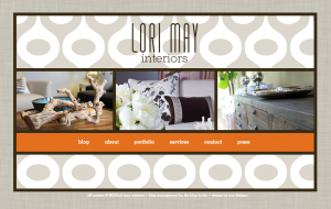
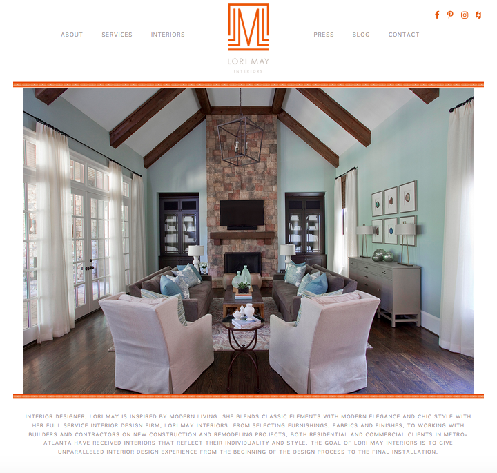
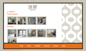
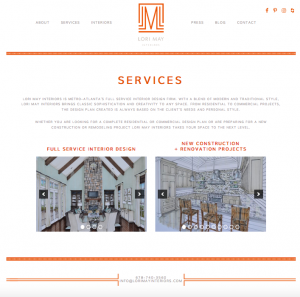
Next was putting the elements of our design plan together on our website. The home page is like your front door. It’s the first impression your guests have of you and your style. We wanted a fresh, clean, and crisp welcome to the guests visiting our website. We kept similar aspects of our former website design but we polished it up and gave it a fresh look.
Take a look at the Before & After.
before
after
before
after
before

after
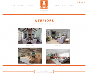
before
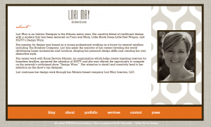
after
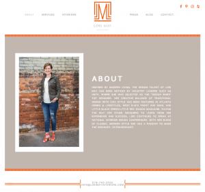
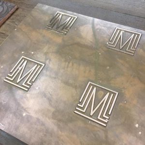
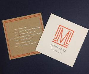
Last but not least, business cards. It’s a “hands on” first impression – similar to when guests come visit and you have either thin, lackluster hand towels or fluffy, luxurious towels. You feel the difference. We selected a paper that feels amazing and the logo is custom debossed, similar to luxurious hand towels customized with embroidered lettering. It makes a statement. It matters. We are so happy with the full service new brand design plan that is now complete. We hope you love it as much as we do!
A big thank you to the design team at Emily McCarthy for designing our new logo and website!
