Last month we toured a client’s finished basement complete with all the bells and whistles. This month we’ll tour this lovely Roswell Ranch home where tradition meets modern sophistication. The heart of this client’s home is the open layout where the kitchen, hearth, dining and living areas come together as one cohesive space. We love the unexpected zebra print rug in the dining room! Don’t be afraid to use interesting patterns and accessories that you love. It brings out your personality in your home. Have fun with it!
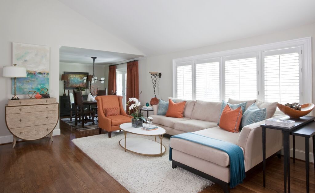
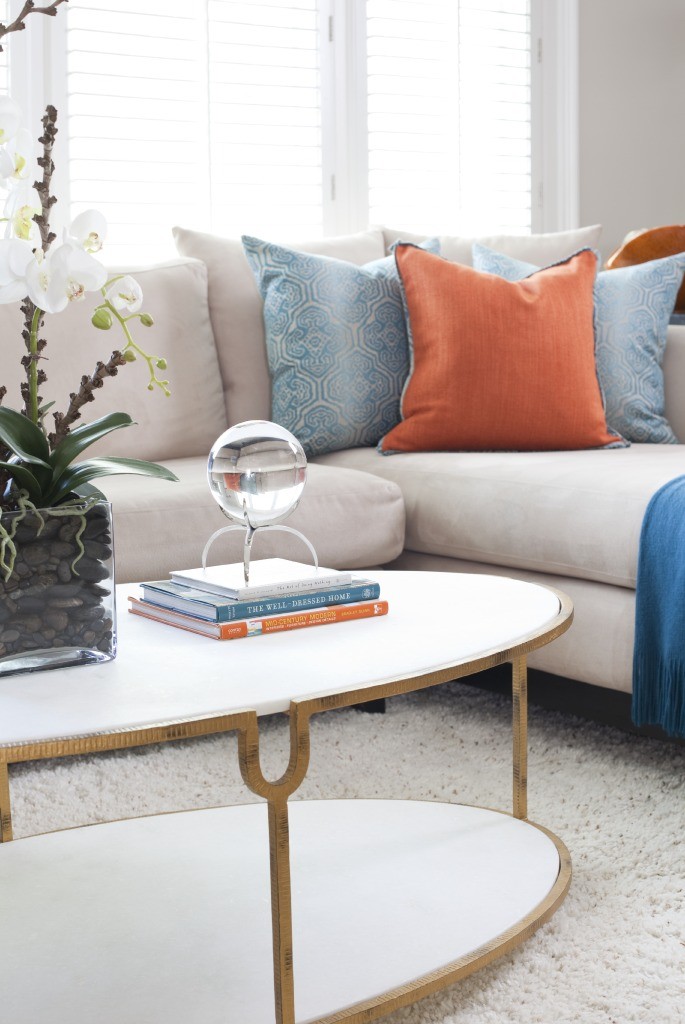
Using orange throughout has an energizing effect complemented by neutral tones and unique accessories. We opted to use white for the rug, table and other accessories because white is both modern and sophisticated…and this client happens to not have children or pets, so a white rug was a “go!” But if you love the modern white and you do have children or pets, opt for adding your white touches to accessories, lamp shades, throws and pillows (with removable inserts so you can launder them!)
We selected furniture and accessories with matte gold trim and hardware, such as the coffee table, lamp, and the beautiful half-oval chest. These metallics bring a touch of modern sophistication to the space.
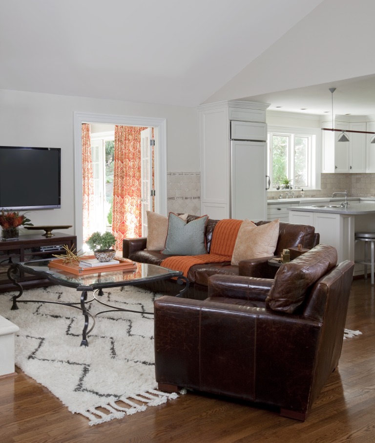
Below, we used the clients existing leather sofa and coffee table but we made the space new again by adding colorful pillows and a throw along with brightening the space with a modern rug. Having a new interior design plan doesn’t mean that your favorite sofa has to go. We can work with your “must stay” pieces and bring new life to them!
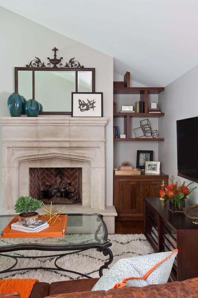
The custom walnut builtins we designed were constructed to allow for both accessory display and architectural interest. The custom shelves create a modern and unique art piece all its own, while the lighter walls allow the accessories to really show. Before, this was simply wasted space, now it has a purpose. Think of areas in your home that you can get creative with and use in a smart and stylish way.
In the next blog we will move to the guest room, office, and guest bath. We’ll share some great tips to help make your guests feel more at home. Perfect timing before summer!



Lori….great job! Love how you used what they had but updated the look with some new items!
Looks great Lori!