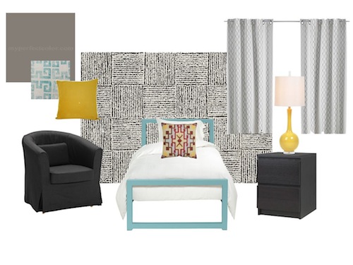
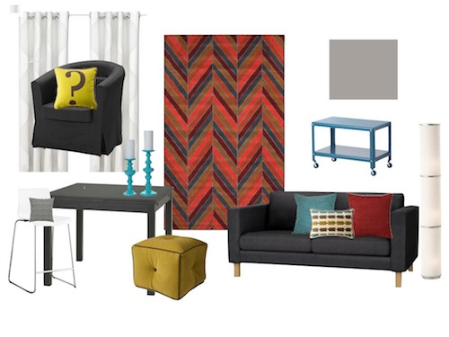
So, on to the fun part. I showed you the before shots of our spaces at the UMCH on Monday and today we’re on to the design plan. Even though this plan is not actually for a paying client, the process is the same. I’m a completely visually person, so having the design plan in front of me make the spaces come alive. Even if we don’t end up using these exact items, these are plans that we can refer to as we find those perfect items.

The beautiful blue bed was the inspiration for the bedroom space. Thanks so much to our friends at Room and Board for such a fabulous donation. The walls will be dark and moody with black and white floor tiles and graphic window treatments. Bright yellow pops against neutral gray walls.

This fabulous herringbone rug was the inspiration for the lounge. We also wanted this area to feel comfortable and cohesive with the bedroom, but a bit more fun. The wall color is lighter, but still in the gray family. The yellow carries over from the bedroom, but the blue darkens to a deeper turquoise. Window treatments with a white background and the white barstool will add contrast.
Design plans are easy to put together and can help you create focus within your own home. You can create a plan on your computer, through programs like olio board or even use pinterest to group together items that you love. Once you have a plan that works for you, keep it with you and when you see something you think you can’t live without, take a quick look at your plan. Does it work? Does it add to your overall plan for your space? If so, get it. If not, move on and be patient. Design plans give you clarity and help you make fewer mistakes in your decorating.
Stay tuned for more to come from our UMCH project. Painting starts next week!


This is looking great Lori – it has a youthful vibe but still sophisticated as well. What a wonderful project to have the opportunity to work on – I would love to do something like this in Philadelphia.
Thank you Holly. You should look into something like this is Philly. I’ll bet you’d do a great job!